AECP: Beautiful Details
Hello,
Today I am showcasing how I added details to my cards. The course by Marika Rahtu showed how to use different coloring medium to add details to the stamped images. I used Altenew inks, Altenew Copic markers, watercolor pencils and watercolors on my cards.
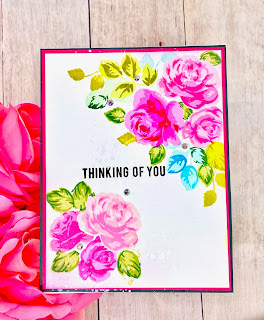
My first and second card features Altenew’s Build-a-flower: Indian Lotus stamp set. I stamped the outline of the lotus on Neenah Solar white 80lb paper with a pale ink and then went ahead and colored it with my watercolor pencils.

I added simple strokes on the petals of the lotus with a dark and light pink. I added more colors on the tip of each petal and toward some of the end of the petals. I left the center petals white. This helps to create some “shading” and contrast for the colors.

Drawing strokes with the color pencils give some details to the petals. I like it that these add more texture and interest to the overall picture. I drew the stems for the lotus and stamped a sentiment toward the center right.

I partial cut a small section of the left panel, leaving the petal and part of the stem. I added some silver glitter paper on the card front and foam mounted the panel on it. I added a few pearl gems to finish the card.
My second card uses the same stamp set but it is colored with water colors. I created a horizontal card this time with a slightly different picture composition.


Each petal has a dark and white shade and this adds to the interest to the lotus. Using a semi wet fine tip brush, I added the “veins” of the petals with concentrated red paint. This added detail differs from the first card above - this card gives a softer and a looser water coloring effect.

Once again, I drew the stems added a lily pad in my picture. Then, I stamped a sentiment and adhered some gems. I glued a piece of gold card stock on my card front and foam mounted the card panel on the card. I like it that different coloring mediums can create different details and “mood” to the cards created.
The third card uses Altenew’s Birds of a feather stamp set. I stamped the birds with different Altenew ink pads.


These dots give the overall picture some shading and texture without much effort. I splattered some ink on the background and stamped a sentiment between the birds. Again, I added some bling on the panel. I added a strip of colored card stock on the card front and foam mounted the panel onto it.
Adding details give my cards greater depths and interest. Using the different coloring mediums, I am confident in creating more beautiful cards in the future.
Have a great week,
Juliet
WOWZERS Juliet!! You blew me away!! So gorgeous!
ReplyDelete