AECP: Polychromatic
Hello,
Today’s blog is about coloring techniques. Polychromatic and monochromatic colors gives a different mood and feel to a card. It is interesting to know that colors adds vibrancy and adds interest to the images and overall card composition.
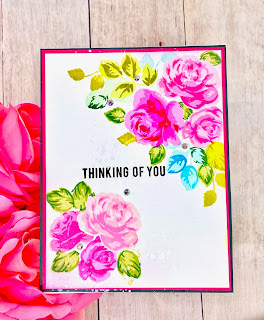
My first card features Altenew’s Build-a-flower: Hibiscus stamp and die set. I used shades of yellow, red, purple and green ink to stamp the flowers and leaves on Neenah 80lb card stock. These contrasting colors adds vibrancy to the card.

Once the stamping is complete, I die cut the images with the coordinating dies and set them aside. I die cut a square window from another white card stock and added a piece of accetate at the back. I prepared a card base measuring 4.25” by 5.5”. I added some iridescent glitter onto the card front and foam mounted the square window on it.


I splattered some black paint on it and allowed it to dry. Once the panel is dry, I foam mounted each hibiscus flower toward the left of the card. I stamped a sentiment on a strip of card stock and foam mounted it onto the top of the flowers. To finish the card, I added a few sequins for some bling.
My second card uses Altenew’s Rosy 3D embossing folder. I embossed the image onto a water color paper and cut it to 5.25” by 5.75”. I used Altenew’s watercolor 36 half pans to color the rose. This time, I used only 1 color to color my image.

Using only the color pink, I added a concentrated amount of color toward the inner petal. To dilute the color, I added a small amount of clear water to “drag” the color toward the outer petal. I continued to add more clear water till the tips of the petal is a light pink.


I continued to do this for all the petals on the rose. Once the image is completely dry, I glued the watercolor panel onto a pink card stock. And then I foam mounted it to a card front measuring 5.5” by 6”. I added a small amount of glue on the inner petal and added some fine glitter for some shine. Once it is dry, I stamped a sentiment in pink ink. This monochromatic card is unique and special in its own way.
My third card uses Altenew’s Poinsettia 3D Die set. This time, I use colors that coordinate and blend well with each other like in a color family on my card. I chose pastel colors - soft pink and purple for my card.

I die cut the poinsettia from 80lb Neenah card stock and vellum. Using only the colors pink and purple, I blended the colors onto the white Neenah card stock with a blending tool. I die cut a piece of soft pink card stock cut out the edge using Pinkfresh studio’s Classic edgers. I foam mounted the pink card stock onto the card front.


I stacked the poinsettia petals alternating between card stock and vellum to create the flower. I adhered the completed poinsettia toward the left of the card front. I splattered some white paint on the card and allowed it to dry. Then, I added a few sequins to complete my card. This is so different from the traditional red poinsettias Christmas cards. I love it!
Playing with colors is so much fun- especially when you get to use multi colors, monochromatic colors and colors that blend well together. They always give a different feel and mood to the cards I made.
Have a wonderful week,
Juliet

OMG! I am just BLOWN AWAY. Speechless!
ReplyDeleteThank you for your submission!
These are absolutely GORGEOUS!!! SO INSPIRED!
ReplyDelete