Hello,
Welcome back! I learnt how to use different watercolor media to color my images on my cards. There are many watercolor media out there. Today, I’ll be using Altenew’s watercolor brush markers, Dr. Ph. Martin’s India ink and Kuretake Gansai Tambi watercolors. I used watercolor paper for all my cards. Together with Altenew’s famous floral images, I had a blast coloring them.
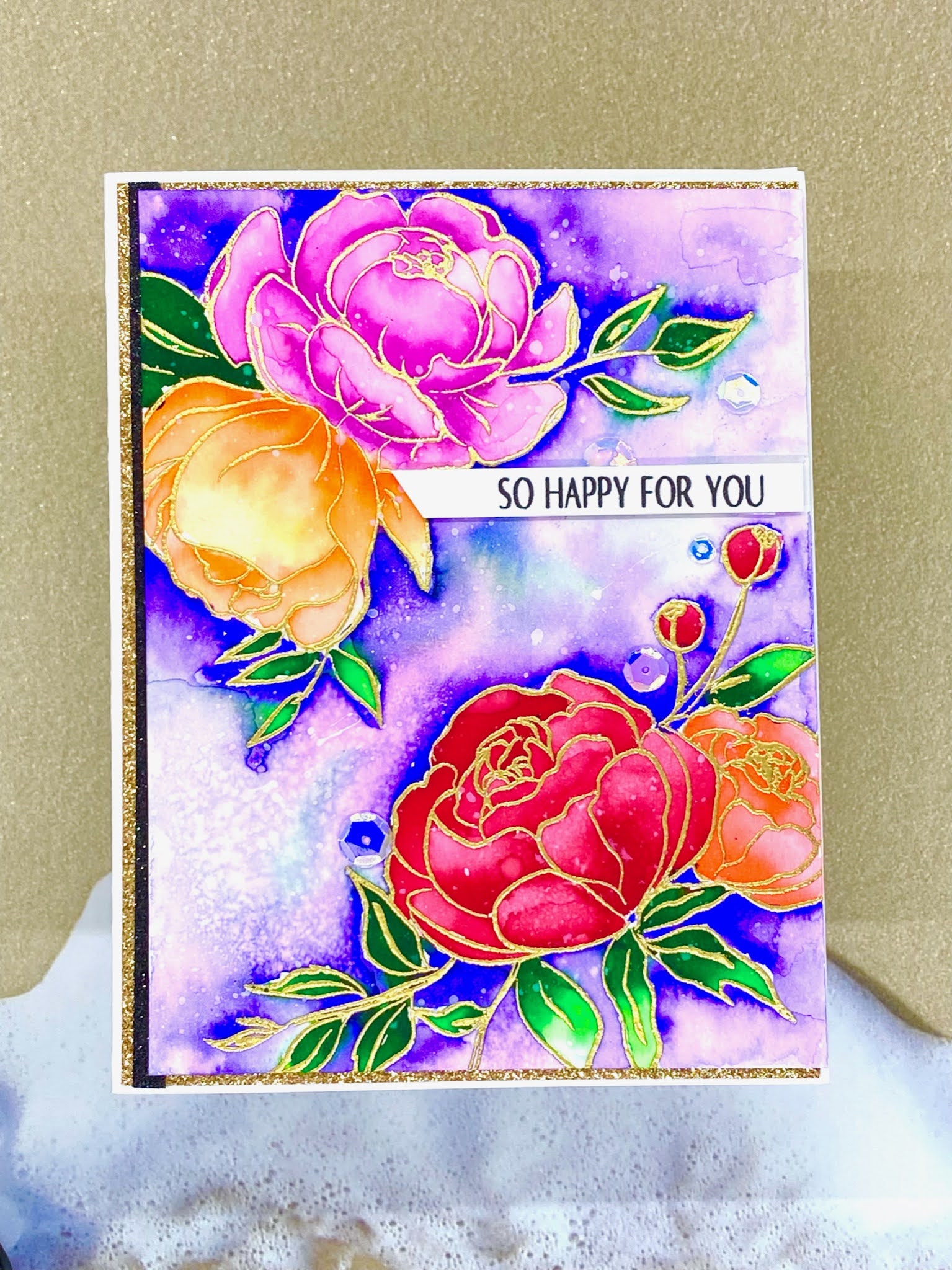
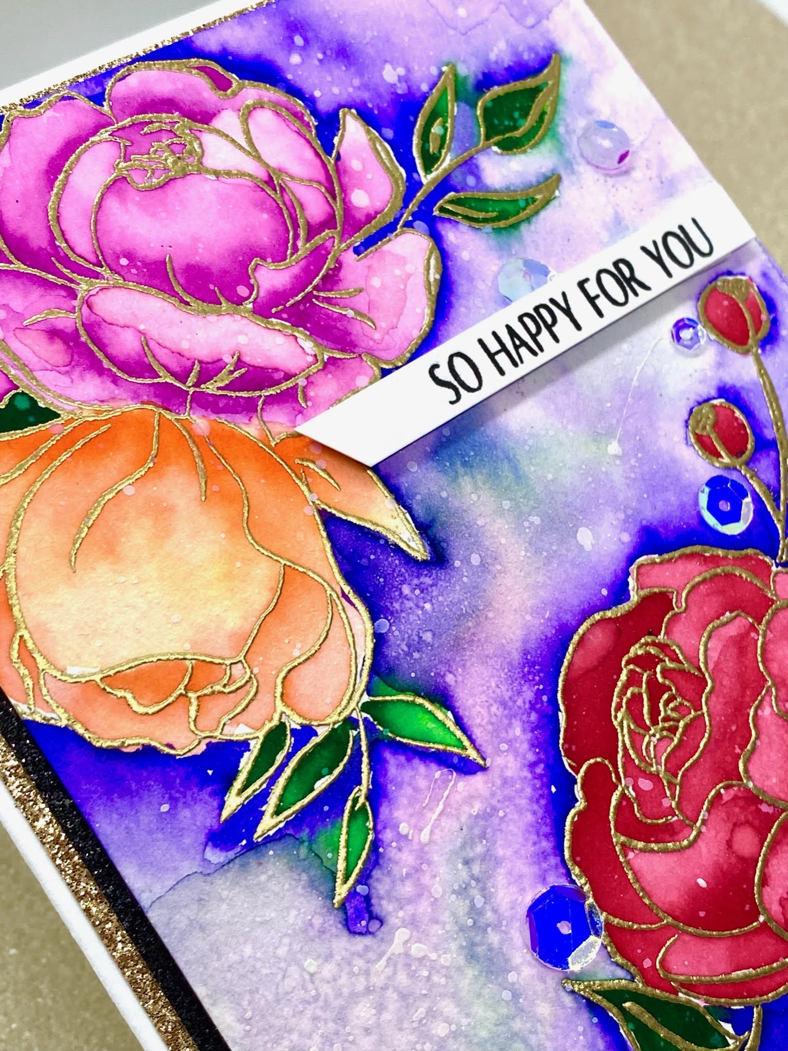
My first card uses Altenew’s Flower Garden. I stamped and embossed the floral images with clear embossing powder. Then, I spritzed the whole watercolor paper with clear water.
I used Dr. Ph Martin’s India ink to color my images. While the images were wet, I added my colors on the flower petals and watched the colors disperse with the water. This wet on wet coloring technique is really quite magical as the colors work their way with the water. I added some darker colors for some contrast.
India ink is permanent once dried. Once the whole panel is dry, I spritzed the whole paper with clear water again. I added blue India ink to the background of the floral images. As the ink dries permanent, the water does not smudge with the other colors that were already there. I added a thin strip of gold mirror card stock toward the lower half of the panel and added a sentiment above it. I foam mounted the whole panel onto a white card stock and added a few sequins.
My second card uses Altenew’s Precious Peony. I stamped and embossed the floral images with gold embossing powder.
I used Altenew’s watercolor brush markers to color the floral images. The embossed images creates a “well” to hold the paint and water within the boundaries of the embossed images. I added a small amount of concentrated watercolor at the ends of the petals and blended it with clear water, to lighten and blend the colors out.
I continued to do this with all the images and added some darker shades of colors for some contrasts. I continued to add concentrated water colors at the exterior edge of the images and watered the colors out with clear water. Then, I foam mounted a sentiment onto the card panel. I added a gold glitter card stock as a backing and a thin strip of black glitter card stock on the left of the card front. I foam mounted the panel onto the card front. I added a few sequins too.
My third card features Altenew’s Book Cover Engravings 3D embossing folder. I ran the embossing folder in my die cutting machine on a piece of watercolor paper. I used Kuretake Gansai Tambi watercolors to color the floral image.
Like in the previous card, I added a concentrated amount of watercolors towards the end of the petal and added clear water to dilute the colors on each petals. I continued to do this for all the images, including the leaves.
Once the images are completely colored, I added some “scallop” details for the 4 corners of the watercolor panel and added a black card stock as a backing. I foam mounted the panel onto a 6 by 6 inch card front. Then, I spritzed the whole card with some glitter.
It took some time to color the images on the cards but it was so worthwhile. Different water coloring medias have different properties to help make the card more vibrant and special. It is therapeutic and I really enjoyed myself very much!
Have a wonderful week,


OH MY! Juliet!! You had me at watercolour!! So gorgeous! Love all the cards you have shared here. Way to go!
ReplyDeleteThank you for submitting your work to the AECP assignment gallery.